Graphs
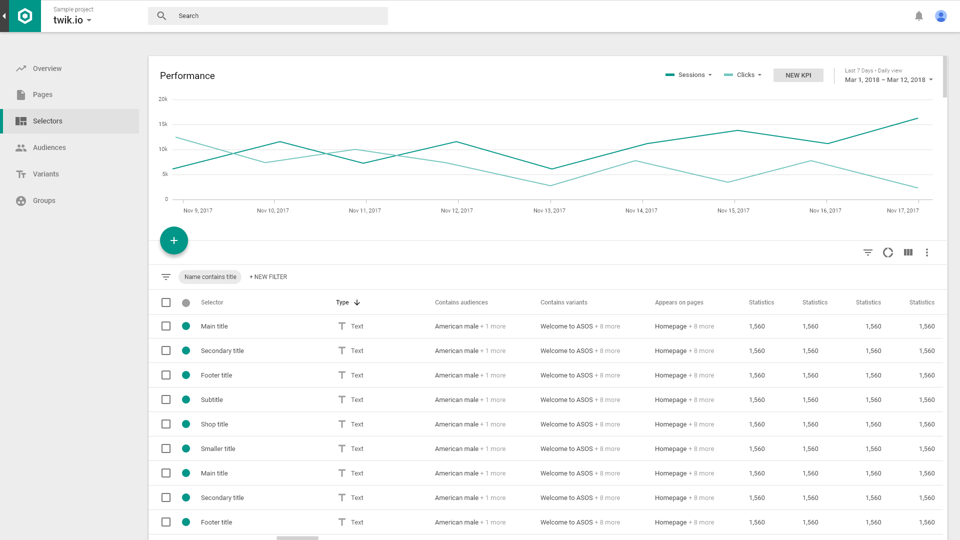
Compare ‘control’ vs. ‘test’ performance results across different KPIs, on different timeframes, with split line-charts, visualizing the effects of twik expreminets on your site visits.
KPIs (Metrics)
- Each selected KPI will be represented as a different color-line on the graph
- Hovering on a line-keyframe will display a pop-up with the performance of that KPI for the specific time-keyframe
- Graph pop-ups display the total amount for a specific KPI along with Test/Control data and the change-factor (performance increase/decrease percentage between eligible test/control)


